.png)
Check out some of my
work
BLUEBOUND WOMEN
WHO:
Bluebound Women is the first global community bringing together women who love watersports- surfing, paddle-boarding, wakeboarding, kitesurfing, diving, swimming, sailing and more. This community shares articles written by female authors and facilitates in-person events for finding new friends, asking questions, getting info and tips and feeling inspired. They’re on a mission to empower girls and women that love the water. Whether that’s helping you learn something new, connecting you with women in your local area, sharing your real stories, or campaigning for equal prize money and plus-size wetsuits.
My Job:
Charlotte’s previous business had changed from somewhat of a seed of an idea to something much bigger. She was ready to create a brand that signified boldness, strength, fun, water and community.
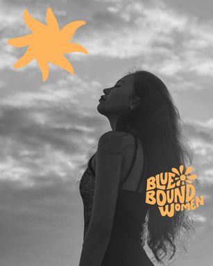
We looked at so many trends and styles to really find the right blend we were aiming for. She wanted something really different from the typical surf brand colours because this was no typical brand. This was something we discussed because sometimes certain colours are significant to certain industries for a reason. We used an orange which is really energetic and symbolises the sun and created something with a complete balance of not too overly feminine, bold and empowering.
I hand drew warped text for that perfect wavy, surfy, don’t-take-yourself-too-serious vibe. This really sets this brand apart and is so unique to them.
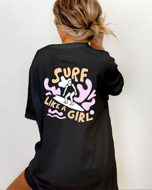
Charlotte knew exactly how to put her branding into action with some previous knowledge on website building along with her across-the-board style guide I created so that her branding was consistent across all channels. We also got to work shortly after on some hand drawn t-shirt designs for merchandise for her existing and new die-hard fans. The response was outstanding!
WILD & CRULETY FREE
WHO:
Marissa has something more than just a passion but a purpose with Wild & Cruelty Free. Wild & Crulety Free is a Vegan and Cruelty Free Beauty and Wellness store stocking makeup, skincare, fragrance, hair, nails, body and self-care products. The focus is on Australian Brands that are clean, conscious and kind to the planet. We Educate and inspire through video tutorials, application demos and masterclasses. Our mission is to ensure animals don't suffer for our vanity, to empower women with effortless beauty and the importance of voting with their dollar to support our local economy and ethical Australian vegan and cruelty free brands. Together we can make a difference and create a kinder world for all.
My Job:
Marissa had a plan, she knew where her business was heading and what vibe she wanted to convey with her branding- kindness, empowerment, community and sustainability with a bit of a retro edge.
We looked at current trends but also keeping in mind trends aren’t the be all because after all your brnad is here for the long run and it has to truly work for you. If you don’t love it you won’t use it!
The logo represents simplistic, elegant and funky play with typography. The typography is approachable, inviting, happy, warm and not too serious. The Submark stays within the same style for use in smaller applications, and doesn’t that ampersand just say it all, it could stand on it’s own!
The Secondary logo represents a tag. This is a fun way to play with the logo and symbolises the Wild & Cruelty Free stamp of approval on products they stock. It's slight rounded edges maintains the style and integrity of the warm and approachable brand styling. The hand drawn sun had a rustic appeal that is endearing. It will also be used as a stand alone element throughout the branding, on tees and canvas bags which are stocked and loaded ready to go out to loyal customers.
One thing Marissa was already doing was adding some grain to her images. This adds another element of rustic charm and appeal and creates a recognisability to all of her imagery styling.

FLOURISH MAMA
WHO:
Renee Leeming, founder of Flourish Mama, is all about helping down-to-earth Mama’s feel strong, confident and connected through kind movement and exercise.
Flourish Mama believes all bodies are good bodies, that movement can be fun and that through kindness for ourselves we can flourish in ways we never thought possible.
My Job:
Renee was craving a rebrand that visually signified the shift in how her business was evolving. Entrepreneurs (and #mumpreneurs) in the beginnings of their journeys are often going through natural shifts in their approach to business as we learn what works for us along the way. Believe me I get it!
With a strong philosophy of kindness through movement, self-compassion and community, it was important to symbolise boldness yet femineity in her brand.
We worked together to create a mood board that symbolised her vibe, looking at trends and similar brands yet looking at how we could also capture her unique vibe.
I crafted some simple bold letters with some beautiful intricate wild flowers inside for her logo with an on-trend mix of bold and hand-scripted text.
Since creating a consistent brand with strong foundations, we’ve elevated what was already a beautiful brand with a sweet colour palette to give it a strong and cohesive flair. Renee understands the importance of brand consistency and was able to use all of the elements to style her website, social media, marketing assets and kickass apparel which kindly donates to women in need.

COVE CHILDREN'S CENTRES
WHO:
Cove Childrens Centres are safe and nurturing environments, that are an extension of home.
Believing learning can happen anywhere and anytime, their environments are designed to support opportunities to learn through play - all day, every day.
With modern furnishings, equipment and resources that are well maintained, safe and clean, they also stimulate play-based experiences ready for children to discover and learn.
My job:
It was important to make sure this brand was clean and concise, making sure there were no cliché icons like hand prints or child figures in the logo. With two different centres with two slightly different names, the business wanted to make it consistent and merge the two brands.
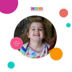
The colour palette included a vibrant orange to communicate the brand’s modern and dynamic approach to early education. To communicate a childcare that truly believes in authentic child centred learning, I used simple shapes and a variety of colours for a clean and fun yet sophisticated layout.


Murals for community spaces
I collaborate with communities to design and paint murals that share their story. Together we chat, plan, and sketch until the design feels right, then roll up our sleeves and get painting. It’s usually a bit messy, always fun, and the best part is seeing everyone’s ideas come to life on the wall — a piece of art the whole community can be proud of.


